
If you own a web page or a brand, you understand how important CTAs (Call to Action) are in your conversion plan.
Your call-to-action may make or break your brand’s success, either assisting you in reaching your objectives or leaving you trailing everyone else.
It is vital to enhance your CTA in order for your website to obtain as many leads as possible.
It’s a feature that enables consumers to travel down the purchase journey and through their buyer’s journey with ease.
The easier it is for people to browse around your content and perceive the value in providing their information, the more likely they are to convert.
A call to action is used to entice your customers to take action or engage with your content. To generate revenue, you want users to take the next step after seeing your content, which may be purchasing your products, signing up for your email, or subscribing to your YouTube channel.
What exactly is a Call to Action (CTA)?
A call-to-action is exactly what it sounds like: a request to your audience to take some form of action on your website.
This might be anything from joining up for an email list to clicking through to a product page to producing leads.
It helps in carrying along your objectives by directing users in the appropriate way and informing them what to do next.
What constitutes a successful CTA?
To build a good CTA that leads to company conversions, you must first determine your objectives, such as:
- Email subscriptions
- More leads on a certain website
- Contest submissions
- Increase your social media following
When you have a strong list of objectives to meet, it’s easier to accomplish them since they’re specific, allowing you to design a plan that’s tailored to your needs.
To persuade consumers to take action, a good CTA employs practical language.
When done right, its wording is compelling enough to persuade people that they must do the action you’ve presented to them.
The usage of verbs is critical when building calls-to-action since the main idea is to get consumers to do what you urge them to do.
It’s critical that the wording in your CTAs doesn’t come off as demanding, irritating, or aggressive.
It’s more about the consumer than it is about you, and you must convince them that there is a value to clicking on that button. In this scenario, using the proper wording is critical.
Your CTA should also convey to your audience a feeling of urgency. The purpose of CTAs is to persuade consumers that they must act immediately or risk missing out on a fantastic bargain or material that will not be accessible for long.
There’s no point if it’s simple to overlook. Your CTA should be the star of the show on your landing page, blog post, and everywhere else it appears.
It’s hard to tell if various components of your CTA are capable of converting more visitors until you A/B test them. When split testing, always try one factor at a time and pay close attention to button colour and copy.
What different types of CTAs are there?
When you think about CTAs, you probably only have one or two in mind because certain calls-to-action are much more common than others.
However, it is critical to understand that you have alternatives and may reach out to your target audience in a variety of methods.
Because each sort of CTA serves a different function, you may discover that one works better than another depending on your primary goal.
Let’s go through the various types of opt-ins for CTAs you can utilise to increase your lead generation.
Exit strategy:
This form of CTA is ideal for situations where people are about to leave your website and go someplace else.
The popup is prompted by exit-intent technology whenever it detects that someone is going to leave your site.
It then makes them an offer and explains why they shouldn’t leave and instead instead hand up their information.
Inline/follow-up:
At the end of a post, an inline or after-post popup occurs.
If readers have previously read a complete page of your information, they are more inclined to join your offer or email list.
As a result, if you already have a dedicated audience, this form of Call to Action is more successful.
These pop ups are less bothersome to consumers since they do not disrupt their viewing experience while still capturing their attention.
Bar that hovers:
A floating bar display, sometimes known as a ribbon or a banner or footer bar, floats at the top or bottom of a website.
It floats up or down content to avoid interfering with the user experience while being visible as users browse through material.
One issue is that these sorts of CTAs might be so subtle that consumers may not see them or even be aware they are there.
Slide-in :
Slide-in pop ups fall to the bottom left or right edge of your website.
They’re useful for persuading customers to interact with your brand even more by offering relevant information.
Many firms use these sorts of CTAs to highlight their lead magnet, but you may direct customers to anywhere you choose.
They’re an excellent approach to pique someone’s interest if they’re ready to abandon your site.
Sidebar :
This popup shows in the sidebar, as the name implies, for convenient access. Visitors may include this in your WordPress website’s sidebar widget.
The advantage of placing your Call to Action in this type of popup is that it is non-threatening to consumers and does not interfere with their watching experience.
However, it might be so subtle that consumers are unaware of its presence.
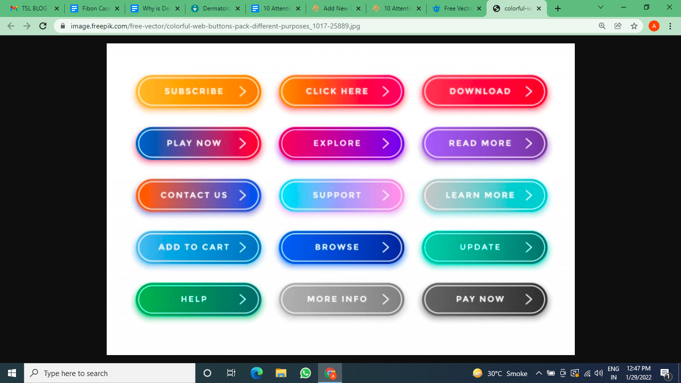
10 Call to action examples :
- Talk to an expert
- Free shipping
- Download now for free
- Claim your free trial now
- Get limited time offer
- Shop now
- Find out how
- Order now
- Get started
- Learn more
To know more about such attention-grabbing call-to-action for your Marketing campaigns, Get in touch with The Social Lions. We will help you not only find the relevant CTAs but also help you run a genuine paid ad.